
a home improvement ally for busy homeowners
Providing homeowners with a seamless solution to find, hire, and manage trusted tradesmen.
Project type: End-to-end app.
Role: Sole UX/UI designer.
Industry: Home improvement.
Tools: Figma, FigJam, Canva, Xtensio.
Duration: 7 months.
Case study
After getting married and moving out of state with my husband, I quickly realized how difficult it was to find reliable, trustworthy, and transparent tradesmen. Soon after, I made friends in the area and found out this was a concern not just for me but also for my new circle. In addition, my husband and I aren’t good at DIY projects (we tried lol).
That’s why, in April 2024, I came up with this idea.
DESIGN PROCESS

Research:
Conducted primary and secondary research.
Focused on users' pain points, frustrations, and challenges.
Synthesis:
Organized insights using affinity maps and empathy maps.
Created a user persona highlighting motivations, frustrations, and goals.
Problem Framing:
Reframed problem statements into "How Might We" questions.
Ideation and Design:
Wrote user stories to guide solutions.
Built a moodboard and style guide for visual consistency.
Designed sketches, wireframes, wireflows, and high-fidelity mockups.
Initial Hypothesis: "Homeowners struggle to find tradesmen."
RESEARCH
SECONDARY RESEARCH
Explored the home improvement industry to validate the project idea.
Discovered that the market is not saturated and has high demand for tradesmen.
Confirmed strong growth potential in home improvement services.
Another finding was that the average time homeowners spend searching for tradesmen is 13 hours.


While the findings supported my initial hypothesis, I needed to go beyond industry data and connect with users to truly understand their needs and frustrations.
PRIMARY RESEARCH
To better understand homeowners, I surveyed 20 people and conducted 5 remote interviews. I recorded the sessions (with consent), captured key insights, and organized them into an affinity map for deeper analysis.
Findings from interviews:
All of the interviewees emphasized how heavily they rely on reviews when selecting tradesmen.
Most of the interviewees expressed a desire to have access to more detailed information about tradesmen.
Some of the interviewees shared their frustration about having to "chase tradesmen down" just to get a quote or schedule an appointment.

SYNTHESIZE
EMPATHY MAP
Using the information gathered from user interviews, I designed an empathy map to better understand my users.
As a result, I created a visual map capturing what users do, think, say, and feel, along with their pain points and goals.
Trust emerged as a major theme when hiring tradesmen.
Users consistently emphasized the importance of:
⭐ Reviews
🌟 Reputation
🤝 Recommendations
These insights became the foundation for developing the app’s persona.
PERSONA
Gabriella Smith
Homeowner in her mid-30s.
Married with kids.
Works full-time, leaving little free time.
Not interested in DIY projects.
Prefers to hire professionals for home maintenance, repairs, and renovations.

IDEATE
PROBLEM STATEMENT
After gathering all the necessary information from my users, I reframed the problem statement by formulating How-Might-We questions to explore potential solutions.
How might we help homeowners easily access reliable information about tradesmen?
How might we provide homeowners with trustworthy and consistent reviews?
How might we improve communication between homeowners and tradesmen?
This was essential because I needed to clearly define the problem I was aiming to solve.
USER STORIES
I created user stories to clearly outline my users' key needs and goals. This helped me stay focused on how users would interact with the product and ensured the design aligned with their expectations.
Those with a priority number of 1 are part of my Minimum Viable Product (MVP).


PROTOTYPE
SKETCHES
Then, I brought my ideas to life by sketching them out. I explored various app interfaces for inspiration, which helped shape my designs.
Homepage
Homepage
Search results
Search results
Tradesman’s profile
WIREFRAMES
The goal was to create a visual representation of the user’s interface without getting distracted by colors, fonts, or graphics.
Until this point, I didn’t know what to name the app or what colors and fonts to use.

Homepage

Search results

Tradesman’s profile

MOODBOARD
Once I finalized my sketches, wireframes, wireflows, user flows, and sitemap, I shifted focus to defining the app's visual identity. To capture the overall look and feel, I put together a moodboard that visually communicated the brand’s tone, personality, and aesthetic direction.
STYLE GUIDE
This was the point where I decided to name the app "Renov", a short and simple way to represent ‘’Renovation’’.
I chose blue as my main color because it represents confidence and trustworthiness, plus it helps Renov stand out from the competition.

HIGH-FIDELITY MOCKUPS
After designing my wireframes, establishing a clear vision for Renov, and creating a style guide, I moved on to designing my high-fidelity mockups. This step allowed me to bring everything together, refining the visual details and ensuring a polished, user-friendly interface.

Tradesman’s profile
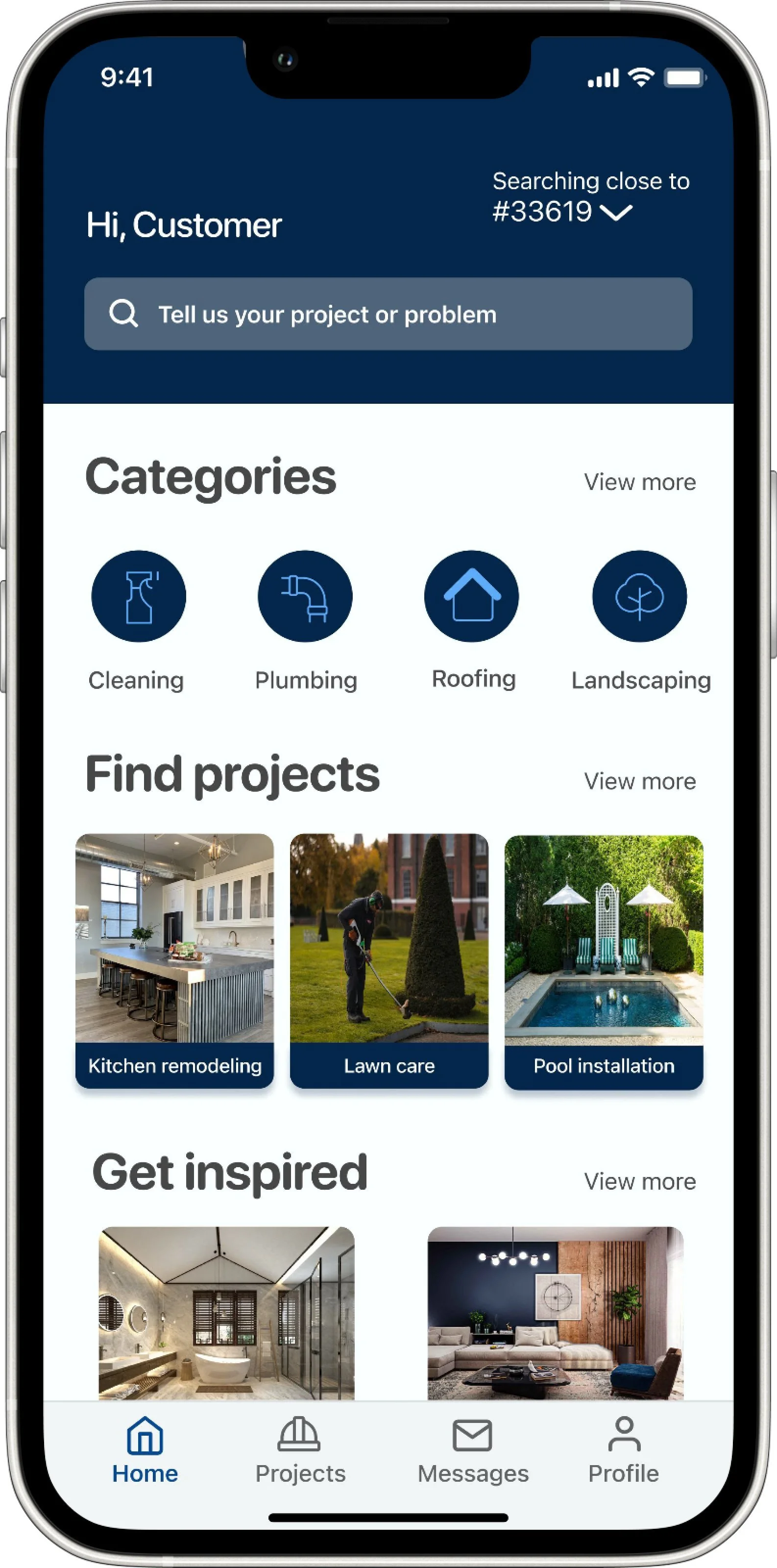
Homepage

Search results

Tradesman’s profile
FINAL PROTOTYPE
The final step of this project was to create an interactive prototype on Figma. This allowed me to bring my designs to life, test user interactions and ensure a smooth, intuitive experience.
Click here to see Renov in action!
WHAT I LEARNED
First full UX/UI project, where I applied the complete design process from research to prototyping.
First full UX/UI project, where I applied the complete design process from research to prototyping.
Gained a deeper understanding of users’ needs, pain points, and motivations, which guided key design decisions.
Developed Renov with intention and purpose by focusing on real user problems.
Refined my skills in UX/UI design, especially in making thoughtful decisions and embracing iterative problem-solving.