TRACKLINE
an improved shopping experience
Understanding users better to design experiences that drive real business results.
Project type: Restructure of browsing experience.
Role: Sole UX/UI designer..
Industry: E-commerce, bicycles.
Tools: Figma, FigJam, Canva.
Duration: 1 month - 90 hours.
Case Study
Trackline is a premium cycling brand known for quality and performance, but its online store didn’t reflect that same standard. This redesign aimed to elevate the e-commerce experience, making it seamless, intuitive, and tailored to the needs of serious cyclists.
DESIGN PROCESS
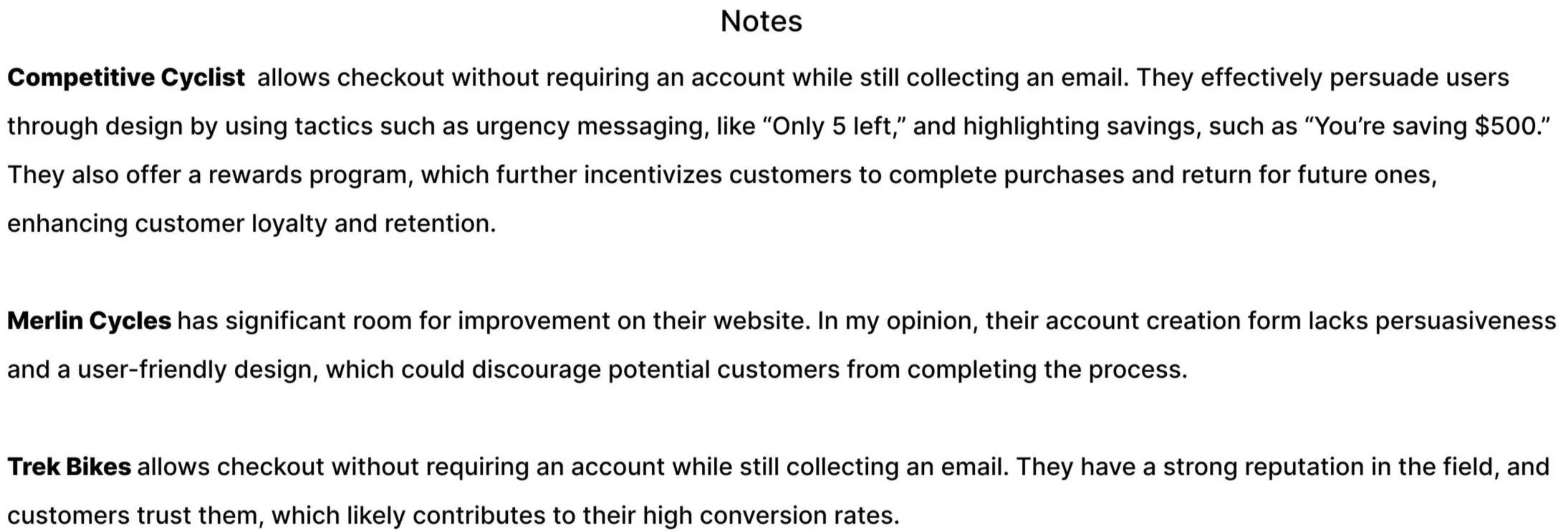
Conducted a competitive analysis to understand the bike industry and identify key competitors.
Developed the website’s user persona to uncover user motivations, frustrations, goals, and behaviors.
Created user flows focused on the main red route and developed initial wireframes.
Ran a first round of usability testing to validate design decisions and identify usability pain points.
Defined Trackline’s brand colors and typography, then built the first interactive prototype.
Conducted a second round of usability testing to assess improvements and gather further user feedback.
Refined and polished the prototype based on the second round of insights.
Successfully delivered the final version of the project within the planned 90-hour timeline, meeting all initial objectives.
Since this project is based on a hypothetical scenario, I was provided with key information, including target users, website issues, brand personality and attributes, and company goals.
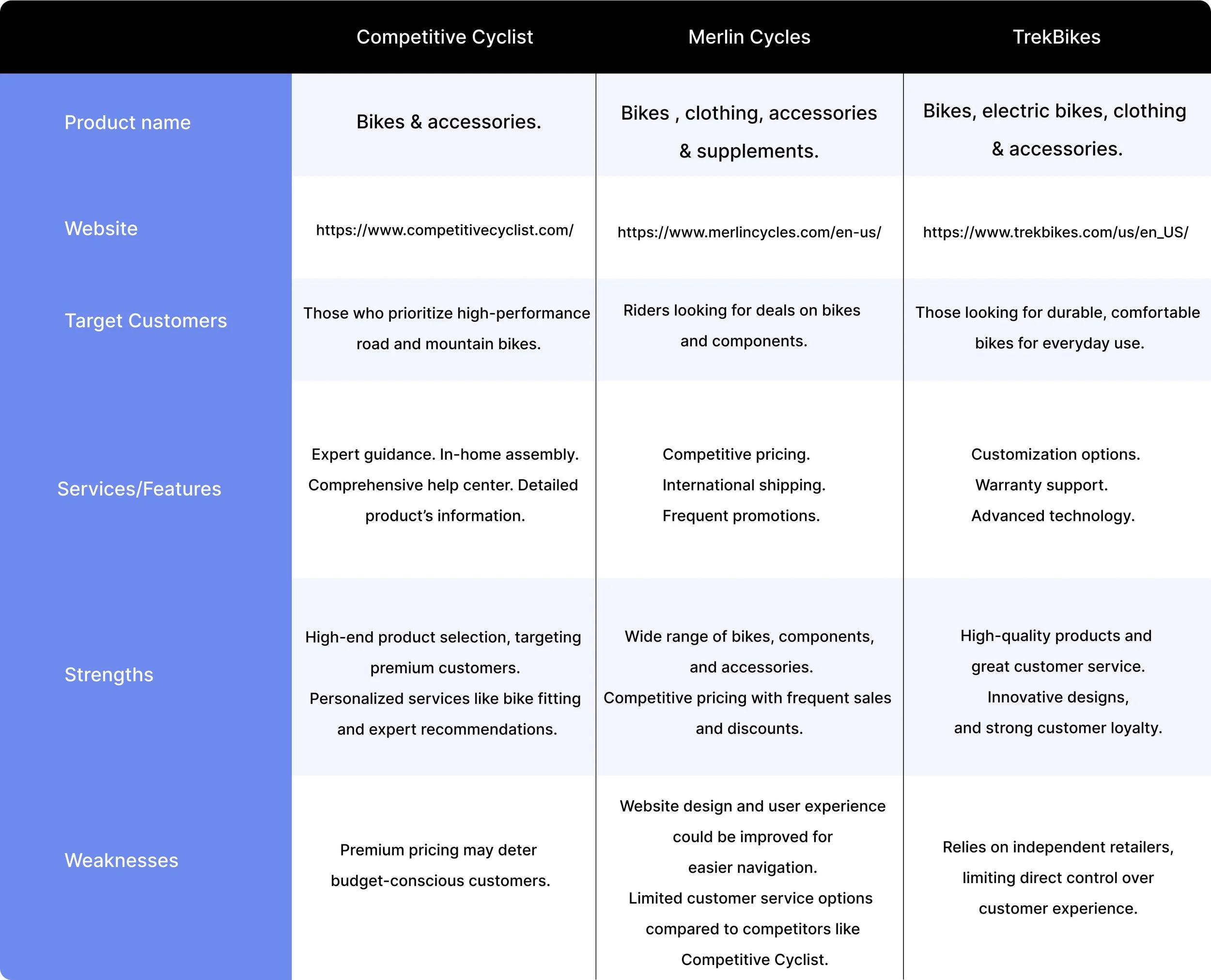
COMPETITIVE ANALYSIS
My main focus was to learn what industry leaders are doing well and identify areas for improvement that I could apply to the product.
PERSONA
Wade Warren
High-income earner in his 30s.
Cycling isn’t just a hobby—it’s part of his lifestyle.
Takes long rides every weekend.
Researches thoroughly before making a purchase.
Willing to pay more for high-quality products.


USER FLOW
I created the user flow for my main red route because I wanted to map out the steps users would take to achieve their primary goal within the website.
This helped me ensure a logical, intuitive navigation structure that would guide users smoothly through the process, minimizing friction and confusion.

WIREFRAMES
I designed the key screens along the red route to start visualizing the layout, structure, and functionality of the website.
Products to compare

Product comparison

Help chat
BRAND COLORS
Since 72% of my target users are high-income men, I chose olive green as the primary color for the mobile website, complemented by a dark shade of gray as the secondary color. My goal was to convey a sense of masculinity while maintaining a sophisticated and refined look and feel.

TYPOGRAPHY
I chose Rubik as the primary font for the website because of its clean, modern appearance that complements the brand’s sophisticated look. Its rounded edges add a friendly and approachable feel while maintaining the professionalism and readability needed for a high-end product.

USABILITY TESTS
Conducted the first round of usability testing with 5 users aligned with the persona.
Collected valuable feedback to identify pain points and areas for improvement in the wireframes.
Made design adjustments based on insights and developed an interactive prototype.
Ran a second round of usability testing with 5 new participants to validate updates.
Identified minor issues during the second round and refined the design accordingly.
Incorporated final changes into the high-fidelity prototype, ensuring it met user needs.
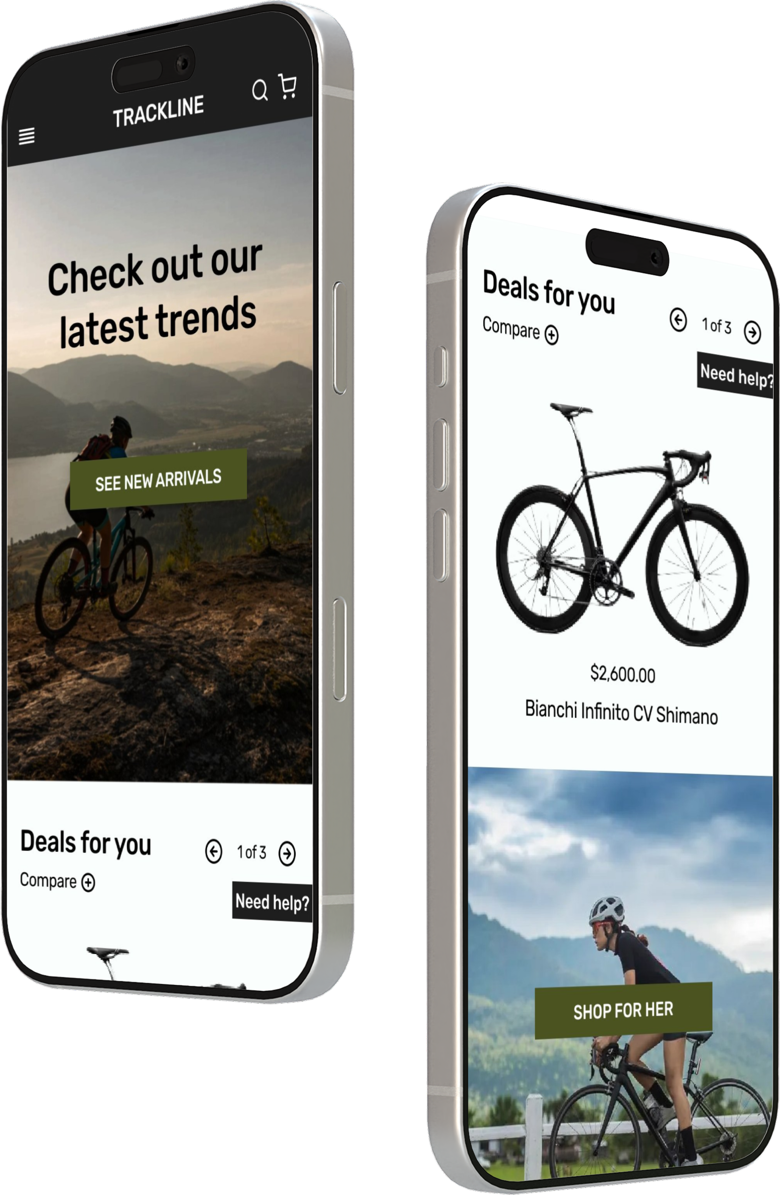
HIGH-FIDELITY MOCKUPS
Interactive prototype here.
Introduced a user-friendly bike comparison feature to support informed decision-making.
Added a help button that connects users directly with expert sellers for personalized guidance.
Enhanced the browsing experience to make product discovery smoother and more intuitive.
Streamlined the checkout process and included incentives like 10% off and free shipping to encourage account creation.

Products to compare

Product comparison
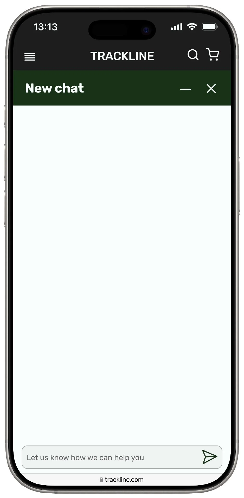
Help chat
WHAT I LEARNED
Simulated a real-world design process by working with clear business goals and a set timeline.
Learned to prioritize strategically, balancing user needs with business outcomes.
Faced the challenge of sticking to a timeline, which strengthened my time-management and decision-making skills.
Gained valuable experience in mobile website design, expanding my UX/UI skill set.
Improved both my problem-solving and efficiency by delivering thoughtful solutions within scope.